New York Based
Want to see more?
Growth Designer
Unifying Hard Rock’s global digital ecosystem ahead of the 2027 Las Vegas flagship launch.
Project Status: Pre-Development.png)

.png)
.png)
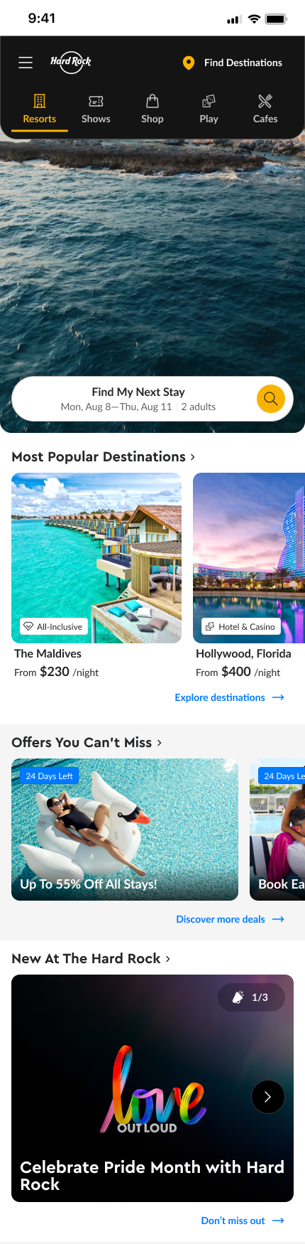
This project unified 30+ legacy sites into a single, modern Hard Rock digital ecosystem. We moved from a fragmented, text-heavy “newspaper” web presence into an experience that converts: bookings, dining, shopping, tickets, and play — while preserving local property personality.
I was brought on as the UX/UI Designer to lead the redesign of all Hard Rock websites as part of the new Hard Rock Experience (HRX) team, the company’s digital transformation innovation division.
Timeline: April 2025—Present (Ongoing)
.png)
.png)


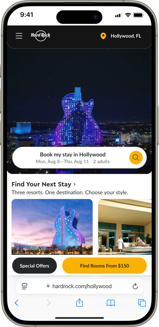


The redesign elevated how millions (75% mobile) interact with the Hard Rock brand globally, faster performance, stronger conversions, and a scalable foundation for every future launch.
Check out more highlights below.
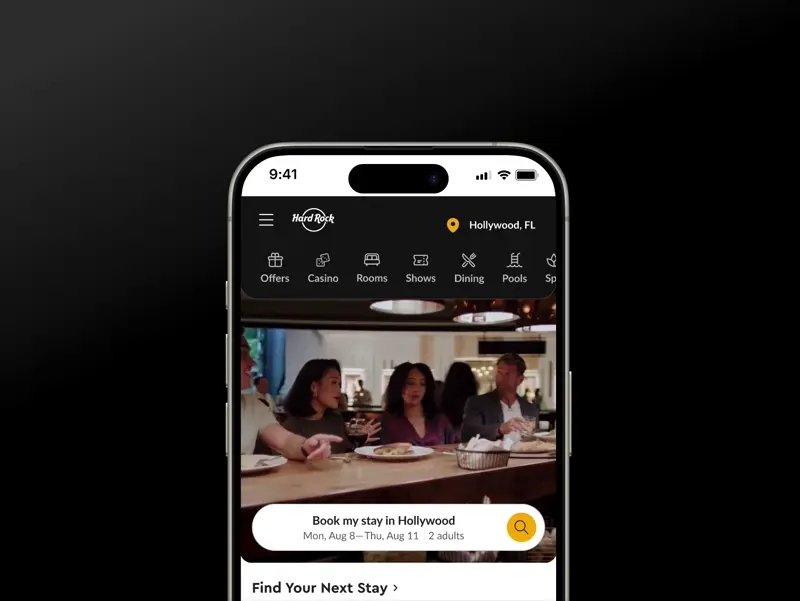
Guests can now move effortlessly between booking a resort, reserving a cafe table, or finding shows — without ever feeling lost in a different site.
.png)
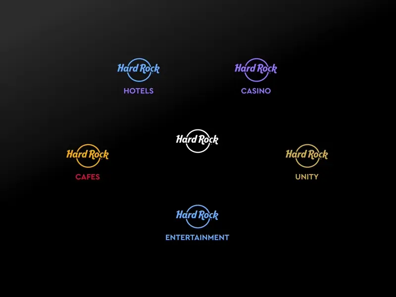
Three pillars that make the new Hard Rock Experience feel connected, trusted, and distinctly Hard Rock.
Effortlessly jump between global Hard Rock destinations without breaking the journey.
Persistent placement in nav for consistency across all properties
Intelligent grouping by brand tier (Hotels, Casinos, Cafes, etc.)
Predictive search and geolocation for instant relevance
.png)
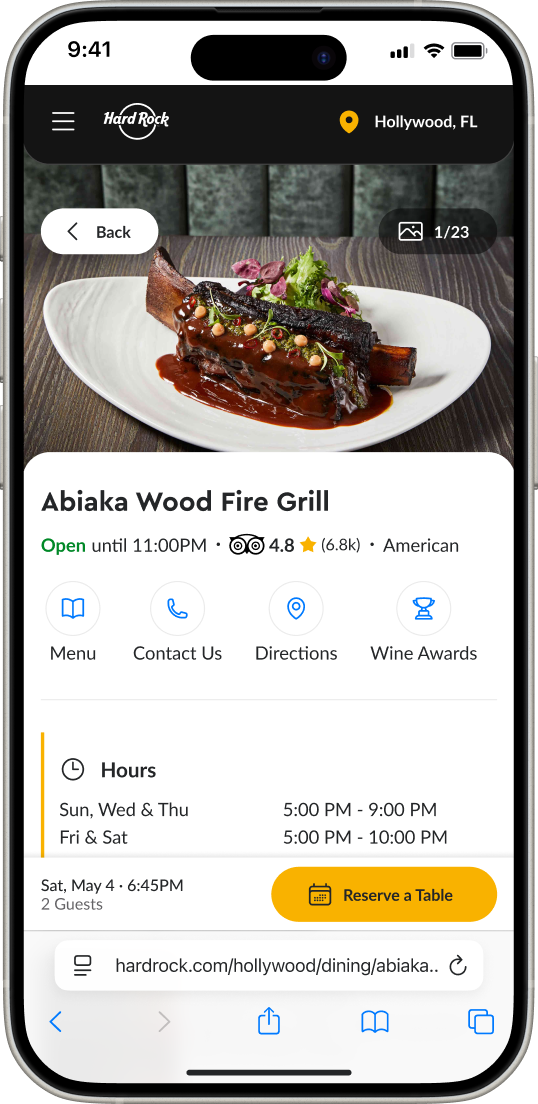
We brought real guest stories, ratings, and user-generated moments to the forefront — transforming credibility into conversion.
Unified rating presentation across Resorts, Cafes, and Casinos
Live feeds and testimonials surface dynamically on location pages
Integrated with events, dining, and stay modules to show authentic experiences
.png)
A universal design language built to scale across five lines of businesses and properties, balancing consistency and local storytelling.
Modular grid and responsive component library
Tokens system for colors, typography, spacing
CMS flexibility to let each property customize while keeping structure intact
.png)
Building a global experience for multiple lines of business wasn’t just a design challenge, it was a strategic one. From mapping user needs across Resorts, Cafes, Casinos, and Entertainment to architecting one scalable system, the project demanded collaboration, clarity, and creativity at every step.
The company was preparing for a high-stakes corporate moment — the new Las Vegas flagship — but the web experience didn’t reflect the brand’s scale or impact. The initial migration plan (copy-to-new-CMS) created a pivot: we had time to do this properly, to turn a migration into a transformation.
Incohesive Journey
.png)
Disjointed LOB experiences and design styles caused silo customer flows.
Lack of Concise Action
.png)
Information architecture buried critical CTAs (no action).
Y2K Styled
.png)
Visual design and content felt dated and text heavy.
URL Debt
.png)
No consistent URL structure or scalable navigation model.
Users wanted clearer pricing, simpler offers, easier mobile discovery, and a streamlined way to find meetings and events.
Key Jobs To Be Done
Find and compare destinations quickly.
Browse stays with a sense of trust and transparency.
Get a sense of brand and property vibe pre-booking.
Find meeting spaces that meet customer capacity and needs.
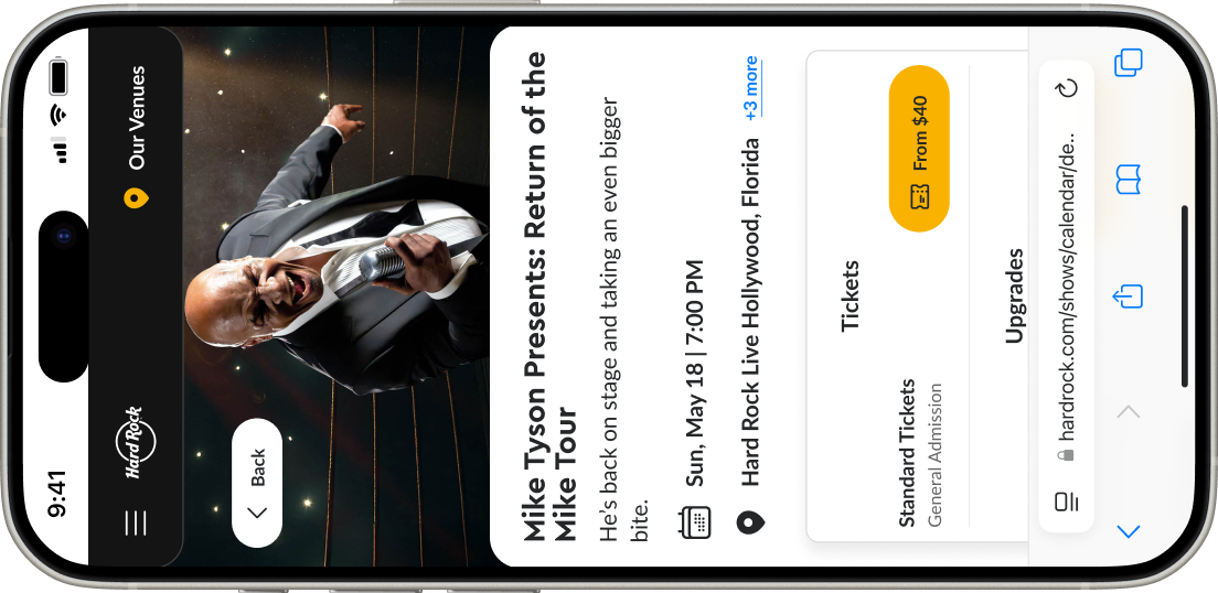
Event pages lacked clarity and engagement, with no real-time status, missed cross-sell opportunities, and little visual storytelling.
Key Jobs To Be Done
Discover relevant shows by date, artist, or venue vibe.
Get clarity on ticket availability and event status.
Book cross-sell experiences (room + dinner) in same flow.
Menus and orders were clunky, events inconsistent, and many users saw Hard Rock as just burgers.
Key Jobs To Be Done
View global + property menu variations and pricing.
Find cafes, order online or book tables quickly.
See when cafes are open + social proof (ratings).
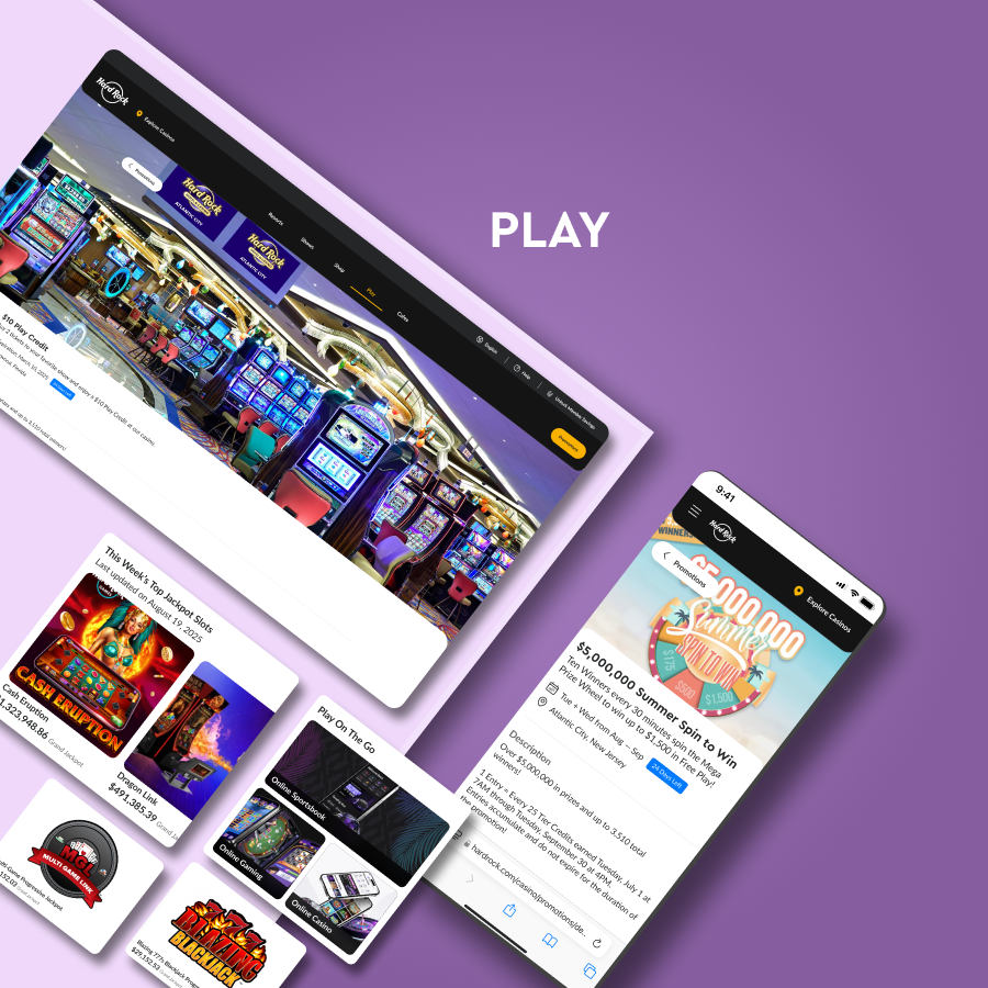
Casino players lacked real-time data, clear promotions, and a central hub for gaming experiences.
Key Jobs To Be Done
Create a sense of "winning" through live jackpots + wins
Explore casinos by map and proximity.
Feel the live excitement of play via the site.
Property sites were long and not action-oriented, details were hard to access, and moving between properties was cumbersome.
Key Jobs To Be Done
Quickly find key property features
Get accurate live info (open/closed, jackpots, event times).
Seamlessly navigate back to brand sites or other properties.
We benchmarked 10+ global platforms to identify familiar yet differentiated interaction models.
.png)
.png)
.png)
.png)
.png)
If we unify Hard Rock’s fragmented digital ecosystem across all lines of business, simplify navigation, surface key actions, and highlight local property personality, then users will find information faster, complete high-intent tasks more efficiently, and engage more deeply with each property: driving higher conversion rates, increased bookings, and stronger brand loyalty.
.png)
.png)
.png)
.png)
.png)
Goal: Make global discovery and movement across Hard Rock’s universe seamless, no matter the user’s entry point.
Global Quick-Tab Nav

Persistent tabs make switching contexts instant. The nav condenses on scroll, preserving wayfinding without friction.
Location Switcher Component
A cross-property tool enabling users to jump between destinations without starting over.
Mega Menu Redesign
.png)
Rebuilt the hamburger/mega-menu to surface high-value pages with visual cues to increase click-through rates.
Unified URL Schema
Shifted from inconsistent legacy paths to a SEO-optimized structure simplifying cross-linking and findability.
Goal: Replace static, text-heavy pages with interactive, emotionally charged experiences that convert.
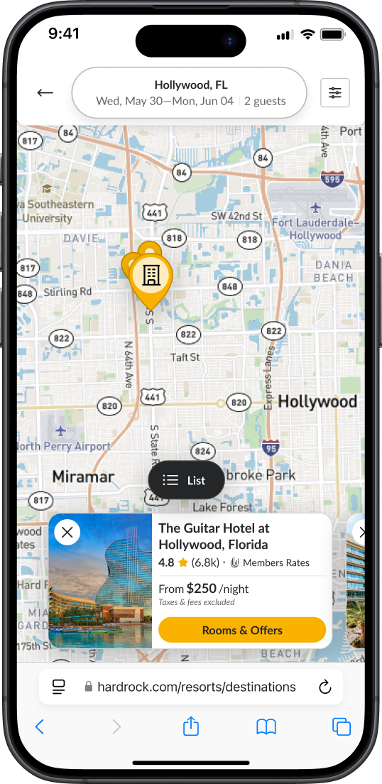
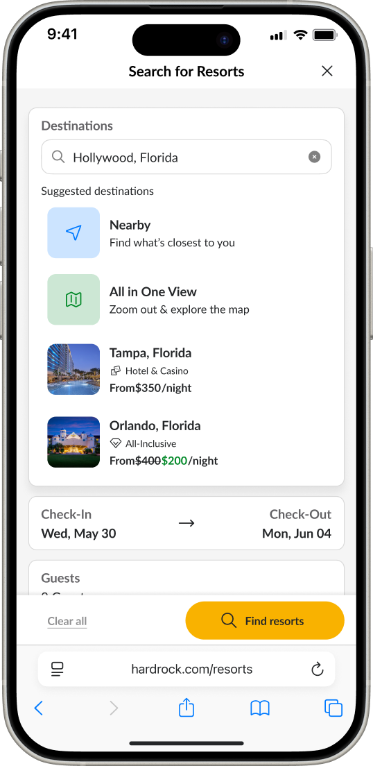
Dynamic Destination Map
.png)
Replaced long static lists with an explorative search experience.
Sticky Action Bars

Context-aware CTAs that appear as users scroll, increasing booking flow completion by 18% in testing.
Social Proof Integration
Embedded TripAdvisor ratings and galleries to replace polished promos with authentic guest moments. Realness converts.
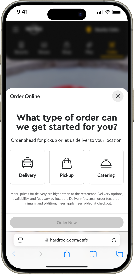
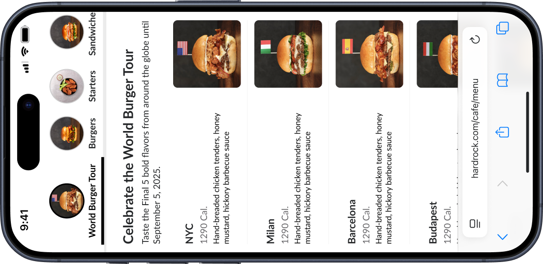
Menu Explorer for Cafes
.png)
Designed a global menu system with image-first browsing and location-based pricing — replacing static PDFs.
Goal: Design once, scale infinitely.
Unified Design Language
Created one shared visual and interaction language across all sites ensuring every touchpoint is cohesive.
Modular Component Library
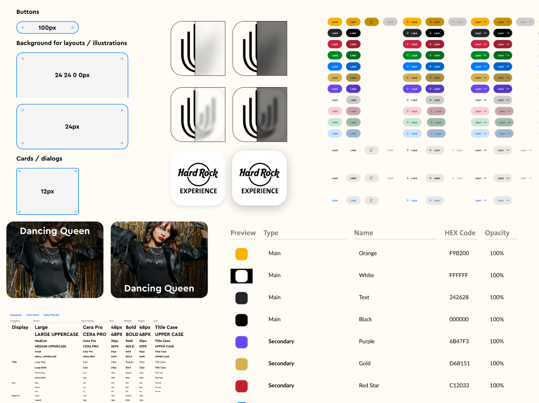
Built a scalable library of reusable UI components, allowing teams to launch new pages and sites faster.
Tokenized Styling Framework

Established a design token architecture that manages styles and sizing to automatically update at breakpoints.
Future-Proofing for Ecosystem
.png)
Designed with cross-platform parity in mind — web and mobile apps all pull from the same foundational design & CMS logic.
Redesigning Hard Rock’s global digital ecosystem wasn’t just about aesthetics, it required navigating organizational tension and technical uncertainty. Before any design work could begin, we needed stakeholder buy-in and a plan to work around a partially migrated platform.
New team + multiple departments = high tension. Early skepticism made collaboration delicate. We gradually met with corporate and property-level stakeholders to gather wishlists, pain points, and expectations. Over time, we earned trust and created allies and champions who could support the redesign long-term.
The websites were mid-migration from Sitecore to Adobe AEM led by our IT team and a team at Adobe, resulting in errors, shifting timelines, and millions of dollars lost. Our team couldn’t fully inherit the product until the migration was complete. To overcome this, we focused on two things: (1) to assist with any quick wins advice we could get IT to implement it, and (2) finalize and get the new redesigned Figma-prototype approved so when we inherited the product we could hit the ground running.
The project worked alongside different properties and LOB's which all operated individually and had their own goals and challenges they faced. Our team worked with varying stakeholders to begin to align them on our shared vision of the brand and digital experiences. While it's in pre-development, the project has already achieved a lot internally and is yet to show the value added to the triple bottom line.
.png)
.png)
.png)
.png)
.png)
This project showed me that scaling design inside a global brand isn’t only about pixels and product, it’s about people. I learned with my team to navigate competing interests, translate business language into design outcomes, and align executives, marketers, and IT under one shared vision.
Our team pushed to integrate LogRocket during the project but faced challenges. Next time, having it from the start would help guide user flows and design decisions with real data.
Once migration is complete, I’d prioritize prototyping and implementing an updated experience to the booking flows as this is abig painpoint for current users. Also, removing the need for a separate loyalty website and embedd it throughout the core brand sites is a key next step.